ZYN(e)
- wico5952
- Sep 28, 2023
- 3 min read
Updated: Oct 2, 2023
ARTIST STATEMENT
After the initial idea sparked by the similarity between the words "ZYN" and "Zine", I wanted to do a satirical advertisement style zine mimicking old tobacco ads. I had initially wanted to integrate it with a short story comic but, like those found in gum packs, but when planning it became too confusing. I then decided that it would be interesting to do the zine as a series of advertisements as they may be done today, considering it is not something often seen as there are heavy restrictions on how nicotine and tobacco products can be sold. The ZYNe is pocket size, roughly the same size as a pack of cigarettes and intended that way. The ZYNe is supposed to be semi-ironic, making ZYNs look appealing but the fact it is a nicotine product and the hopefully obvious ways they are meant to look good being the source of satire.
The front cover was intended to be a front cover. While also referencing how one could smoke on planes back in the day, the ban of which circa 1990 is often considered a land mark in the "war against tobacco". The thought being that the discreet nature of ZYNs, and the ability to use them on planes, could be a selling point.
The first and second page, combined as a double spread, is an altered version of Roy Lichtenstein's "Girl with Hair Ribbon", replacing his iconic dots with ZYN packs. Inspired by famous artists being used/commissioned for advertisements such as such as Keith Haring making ads for both Lucky Strike Cigarettes and Absolute Vodka in the 1980's.
The next page is was a pretty simple idea, sex sells.
The next page is a collage of some of the things you can get by collecting ZYN reward points. This is probably the most explicit form of marketing that nicotine and tobacco products are still allowed to use.
The double spread is an altered version of Michelangelo's "The Creation of Adam". Inspired by other ads that have spoofed famous art, such as Allianz Insurance doing "This is not a Hammer", a spoof of Magritte's famous piece. My intention was to replicate how companies will often hire celebrity ambassadors, trying to get people to associate their product with cool people. I was also trying to show the oldest form of advertising, word of mouth, and maybe even a little bit of peer pressure, a direct opposition to the hallmark of the anti drug campaign, "Just say no!".
Formula 1 has always been something I've associated with tobacco and cigarettes, such as the 1991-1992 season champion Williams car branded in its iconic blue and yellow Camel Cigarette livery.
The next page was a take on the modern minimalistic approach to advertising and the simplification of logo, such as Pringles getting rid of the little bowtie.
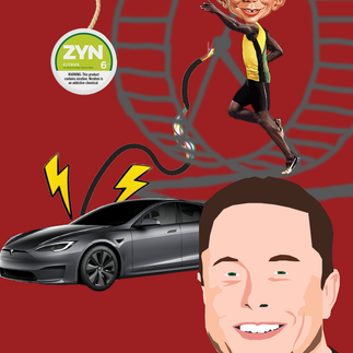
The MAD Magazine double spread was trying to replicate the MAD Magazine style and advertisers using comedy. The comic showing Alfred E. Neuman charging a tesla by turning a hamster wheel while trying to chase down the ZYNs dangled in front of him. The idea being that lots of people in a variety of industries profit from addiction.
The back cover is supposed to be a rainbow. Corporations seem to love to show their "support" for the LGBTQ+ community every time pride month comes around by changing their social media profile pictures to a rainbow version of their logo. But when a large number of these companies still do a large amount of their manufacturing in countries where being anything but straight is illegal, its hard to interpret the temporary change as anything but shallow marketing. Nestle is a great example.


Comments